Ikano Bank
Improving workflow efficiency in a technically constrained banking tool
Restructuring fragmented workflows to support faster task completion for expert users.
View case study →


Parkster
Reducing uncertainty in automatic parking
Problem
Parkster’s ANPR solution enables a seamless parking experience: drive in, drive out, payment handled automatically.
However, user research revealed widespread uncertainty about how the system actually works.
On-site interviews showed that many drivers assumed parking started automatically when it did not. Some received fines as a result. Others double-checked in physical payment machines to avoid mistakes, unintentionally bypassing Parkster’s system.
Research revealed that the core issue wasn’t the interface itself, but that information about ANPR parking was presented at the wrong time and across disconnected touchpoints.
When automation feels invisible, trust becomes fragile.
ROLE
UX Designer (academic client project)
Team
4 designers and stakeholders
Timeline
5 weeks, November - December, 2023
Scope
Information architecture restructuring, terminology alignment, and cross-touchpoint clarification.
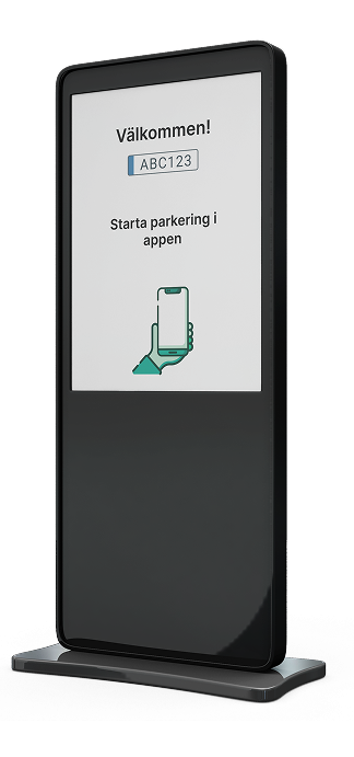
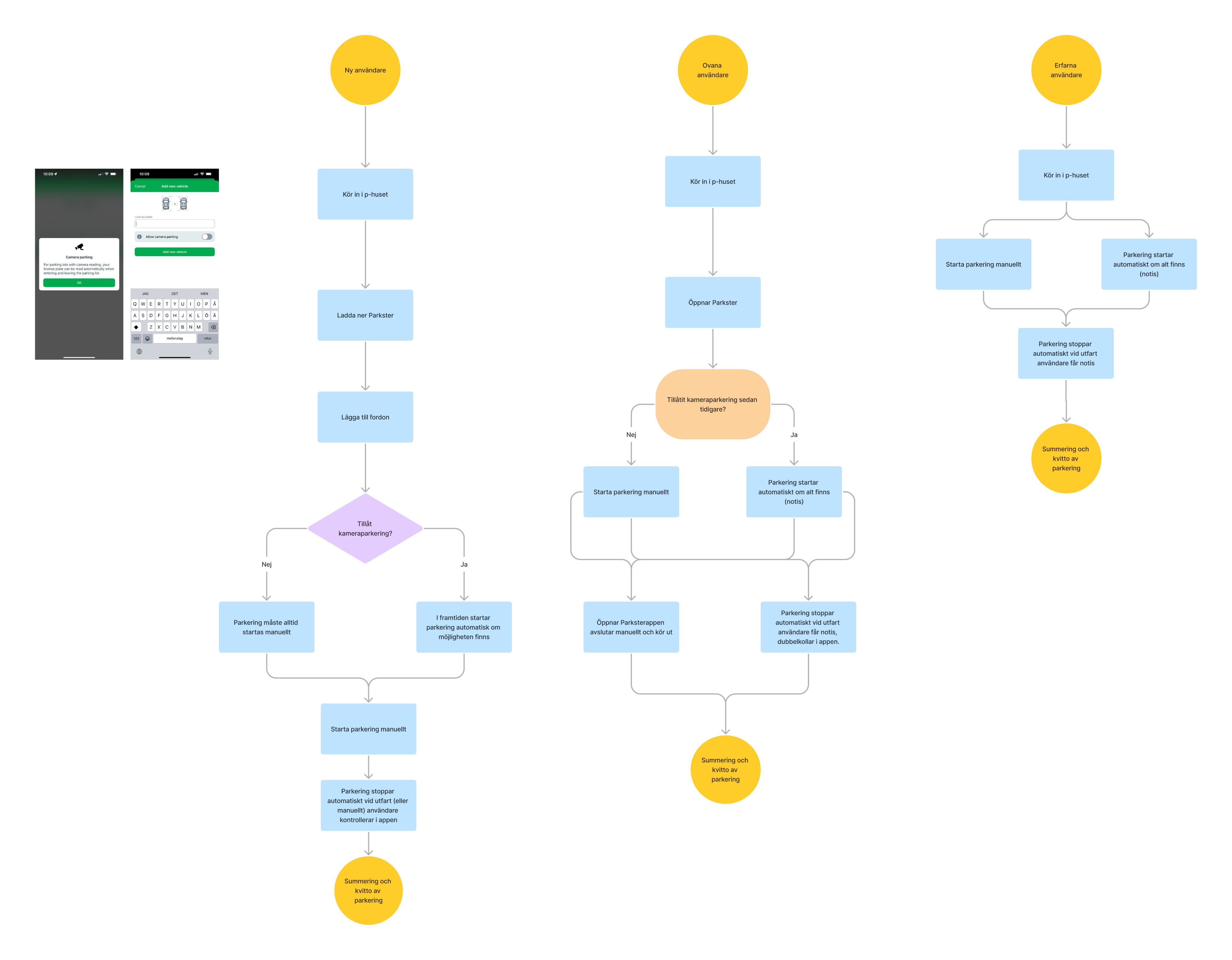
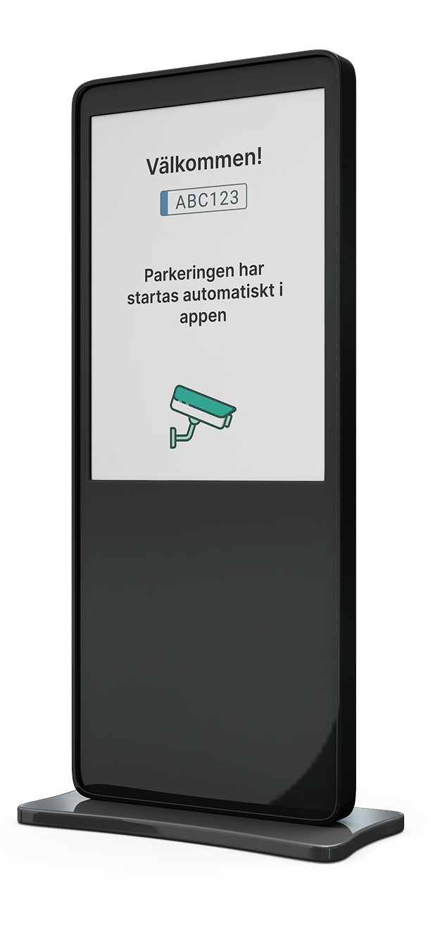
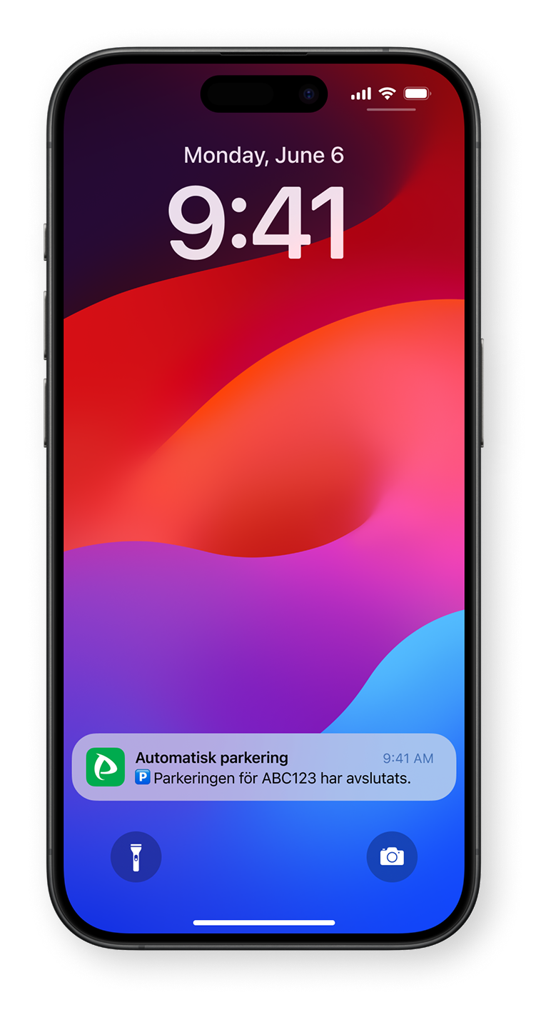
Outtakes from user flow for a first time parker.
Solution
Rather than redesigning features, we clarified how the system communicates. We focused on aligning language, structure, and timing with how users interpret automation.
Key decisions:
User-aligned terminology
Replaced technical terms such as ANPR and camera detection with “Automatic parking,” reflecting how users described the experience.
Sequential information structure
Reorganised content to mirror the real-world parking journey, from entering the garage to confirmation of active parking.
Cross-touchpoint alignment
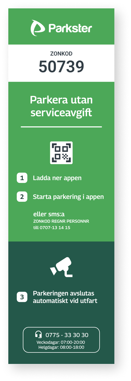
Ensured consistency between physical signage and app communication to prevent conflicting signals.
Clearer feedback and edge case handling
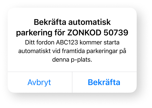
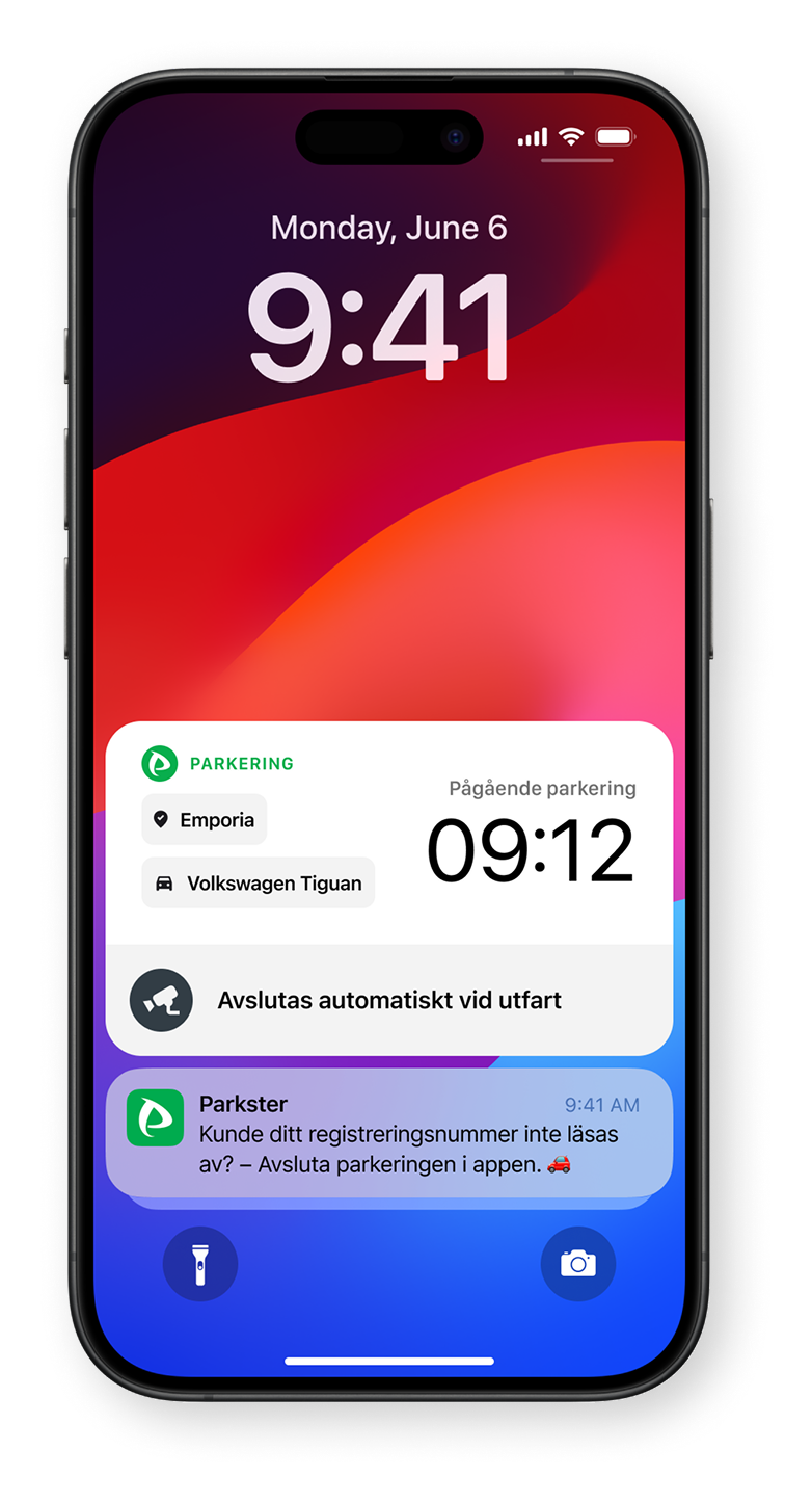
Defined confirmation states and clarified what happens if the camera fails to read a license plate or if automatic start is not activated.
The objective was alignment: system logic, communication, and user expectations needed to match.
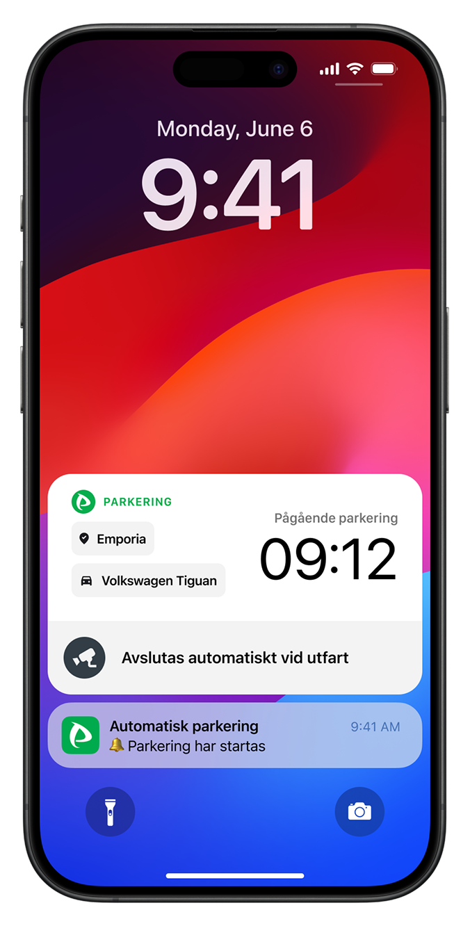
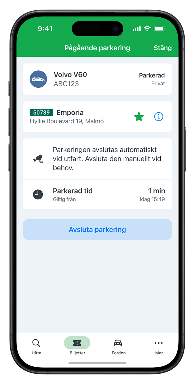
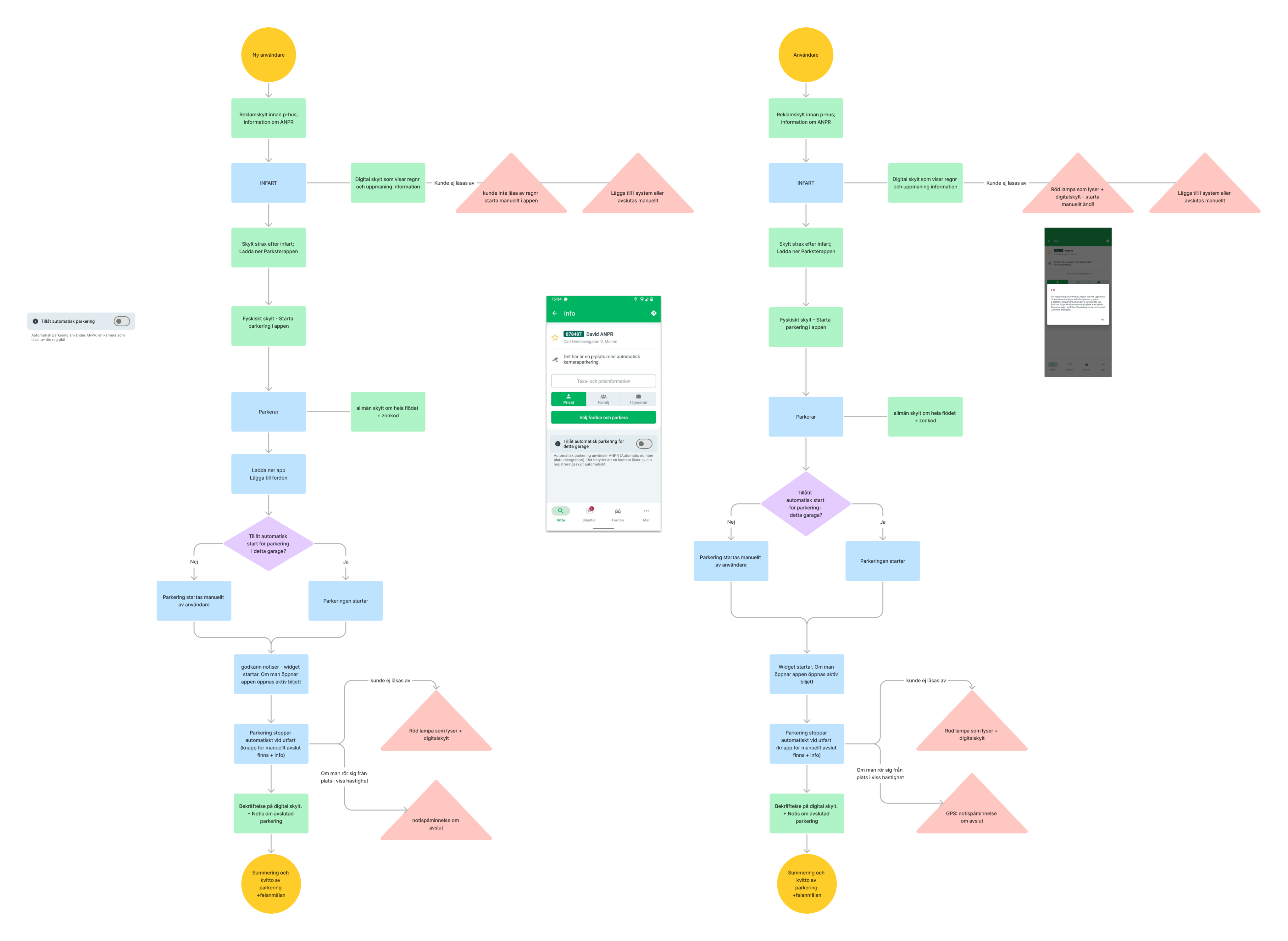
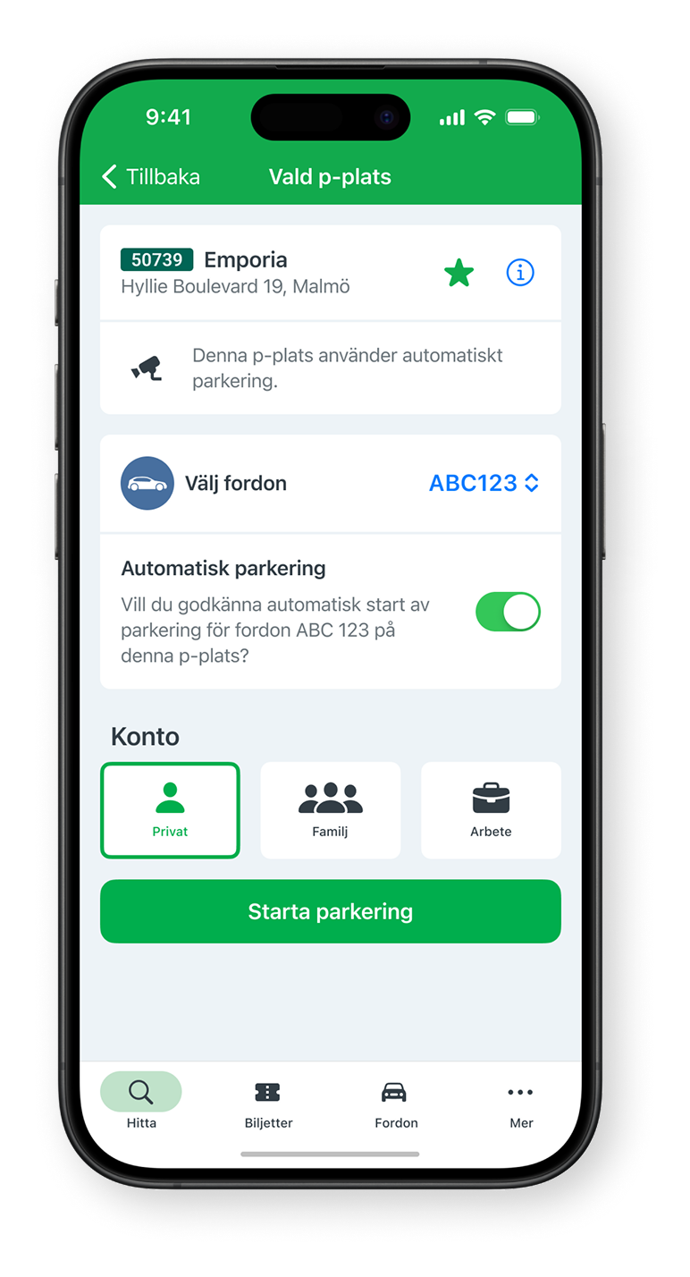
Outtakes from user flow for a user with automatic parking.
outcome
User testing showed improved understanding of how automatic parking works and when it activates.
Participants were able to explain the process in their own words, indicating stronger alignment between their mental model and the system’s behaviour.
The redesigned structure reduced ambiguity and increased perceived reliability of the service.
Parking scenarios before redesign.
Dream parking scenarios based on research.
My Contribution
Co-led user research, on-site user interviews and synthesis, contributing to the identification of key behavioural patterns and trust gaps.
Collaboratively restructured the information architecture and terminology, and translated the revised structure into high-fidelity UI flows and physical signage concepts in Figma to ensure consistency across digital and physical touch points. I also led one of the usability test sessions.
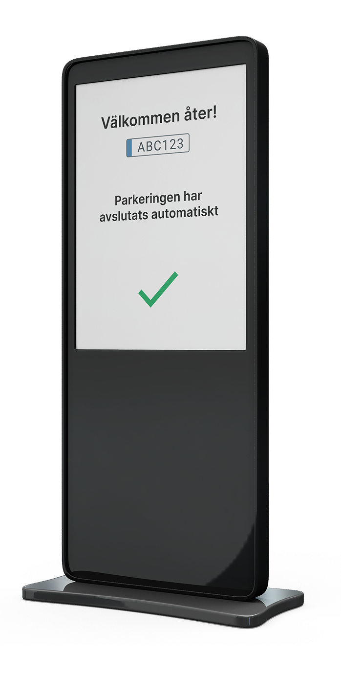
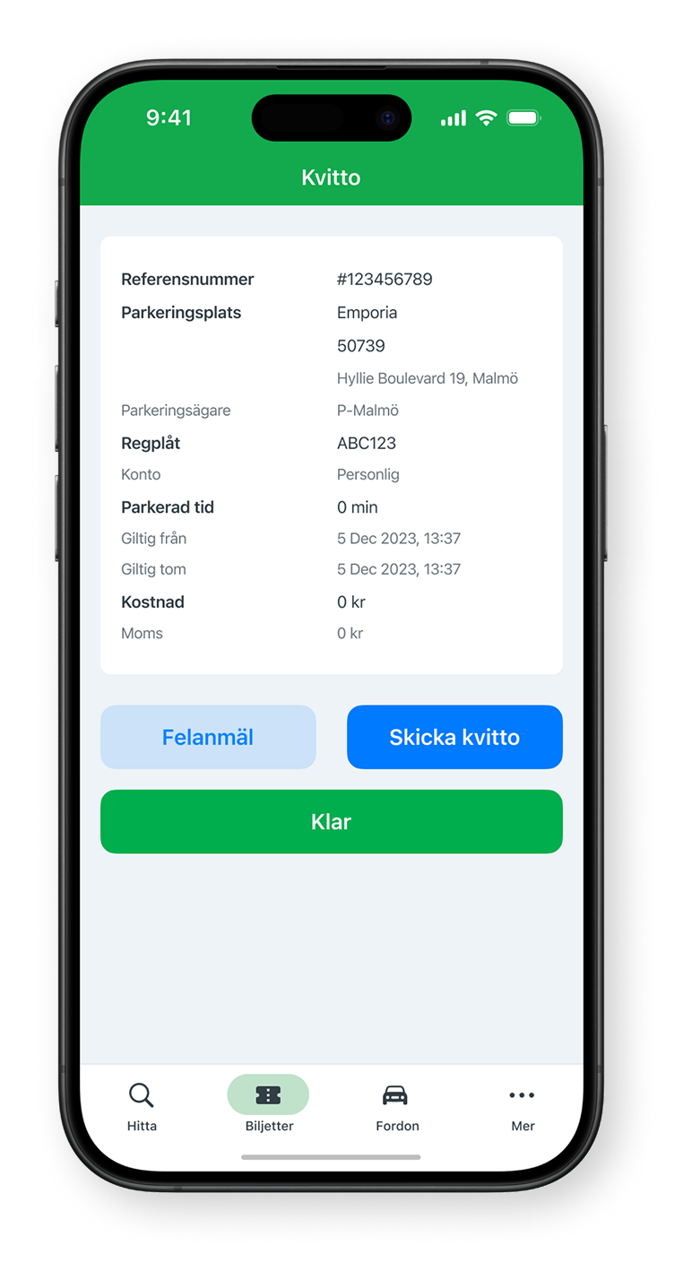
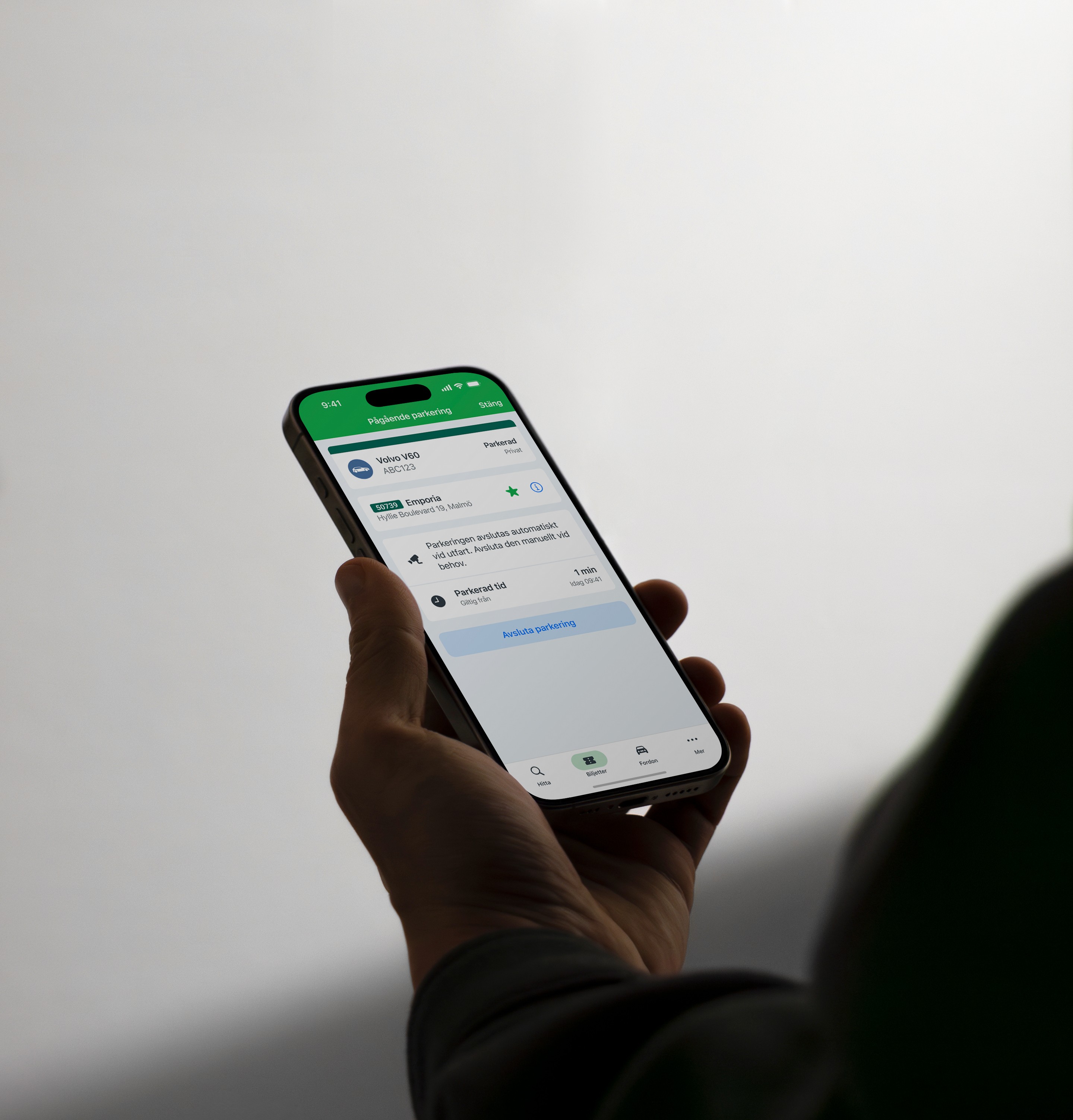
Outtakes from user flow of parking ending.
Reflections
This project deepened my understanding of how fragile trust is when system behaviour does not align with user expectations.
Users compensated for uncertainty with defensive behaviours such as double-checking or using alternative payment methods. In some cases, this led to financial consequences.
I learned that solving the surface issue would not have been enough. The real challenge was aligning logic, language, and timing with how users naturally interpret automation.
This experience strengthened my ability to identify behavioural signals, trace them back to root causes, and design clarity into complex service ecosystems.
Ikano Bank
Improving workflow efficiency in a technically constrained banking tool
Restructuring fragmented workflows to support faster task completion for expert users.
View case study →
Academic project
Lowering the barrier to accessible design
Identifying why UX designers struggle with WCAG 2.2 and prototyping a visual guide that makes accessibility guidelines easier to understand and apply in design work.
View case study →
All work →
Parkster
Reducing uncertainty in automatic parking
ROLE
UX Designer (academic client project)
Team
4 designers and stakeholders
Timeline
5 weeks, November - December, 2023
Scope
Information architecture restructuring, terminology alignment, and cross-touchpoint clarification.
Problem
Parkster’s ANPR solution enables a seamless parking experience: drive in, drive out, payment handled automatically.
However, user research revealed widespread uncertainty about how the system actually works.
On-site interviews showed that many drivers assumed parking started automatically when it did not. Some received fines as a result. Others double-checked in physical payment machines to avoid mistakes, unintentionally bypassing Parkster’s system.
Research revealed that the core issue wasn’t the interface itself, but that information about ANPR parking was presented at the wrong time and across disconnected touchpoints.
When automation feels invisible, trust becomes fragile.
Outtakes from user flow for a first time parker.
Solution
Rather than redesigning features, we clarified how the system communicates. We focused on aligning language, structure, and timing with how users interpret automation.
Key decisions:
User-aligned terminology
Replaced technical terms such as ANPR and camera detection with “Automatic parking,” reflecting how users described the experience.
Sequential information structure
Reorganised content to mirror the real-world parking journey, from entering the garage to confirmation of active parking.
Cross-touchpoint alignment
Ensured consistency between physical signage and app communication to prevent conflicting signals.
Clearer feedback and edge case handling
Defined confirmation states and clarified what happens if the camera fails to read a license plate or if automatic start is not activated.
The objective was alignment: system logic, communication, and user expectations needed to match.
Outtakes from user flow for a user with automatic parking.
outcome
User testing showed improved understanding of how automatic parking works and when it activates.
Participants were able to explain the process in their own words, indicating stronger alignment between their mental model and the system’s behaviour.
The redesigned structure reduced ambiguity and increased perceived reliability of the service.
Dream parking scenarios based on research.
Parking scenarios before redesign.
My Contribution
Co-led user research, on-site user interviews and synthesis, contributing to the identification of key behavioural patterns and trust gaps.
Collaboratively restructured the information architecture and terminology, and translated the revised structure into high-fidelity UI flows and physical signage concepts in Figma to ensure consistency across digital and physical touch points. I also led one of the usability test sessions.
Outtakes from user flow of parking ending.
Reflections
This project deepened my understanding of how fragile trust is when system behaviour does not align with user expectations.
Users compensated for uncertainty with defensive behaviours such as double-checking or using alternative payment methods. In some cases, this led to financial consequences.
I learned that solving the surface issue would not have been enough. The real challenge was aligning logic, language, and timing with how users naturally interpret automation.
This experience strengthened my ability to identify behavioural signals, trace them back to root causes, and design clarity into complex service ecosystems.
Ikano Bank
Improving workflow efficiency in a technically constrained banking tool
Restructuring fragmented workflows to support faster task completion for expert users.
View case study →
Academic project
Lowering the barrier to accessible design
Identifying why UX designers struggle with WCAG 2.2 and prototyping a visual guide that makes accessibility guidelines easier to understand and apply in design work.
View case study →
All work →
Parkster
Reducing uncertainty in automatic parking
ROLE
UX Designer (academic client project)
Team
4 designers and stakeholders
Timeline
5 weeks, November - December, 2023
Scope
Information architecture restructuring, terminology alignment, and cross-touchpoint clarification.
Problem
Parkster’s ANPR solution enables a seamless parking experience: drive in, drive out, payment handled automatically.
However, user research revealed widespread uncertainty about how the system actually works.
On-site interviews showed that many drivers assumed parking started automatically when it did not. Some received fines as a result. Others double-checked in physical payment machines to avoid mistakes, unintentionally bypassing Parkster’s system.
Research revealed that the core issue wasn’t the interface itself, but that information about ANPR parking was presented at the wrong time and across disconnected touchpoints.
When automation feels invisible, trust becomes fragile.
Outtakes from user flow for a first time parker.
Solution
Rather than redesigning features, we clarified how the system communicates. We focused on aligning language, structure, and timing with how users interpret automation.
Key decisions:
User-aligned terminology
Replaced technical terms such as ANPR and camera detection with “Automatic parking,” reflecting how users described the experience.
Sequential information structure
Reorganised content to mirror the real-world parking journey, from entering the garage to confirmation of active parking.
Cross-touchpoint alignment
Ensured consistency between physical signage and app communication to prevent conflicting signals.
Clearer feedback and edge case handling
Defined confirmation states and clarified what happens if the camera fails to read a license plate or if automatic start is not activated.
The objective was alignment: system logic, communication, and user expectations needed to match.
Outtakes from user flow for a user with automatic parking.
outcome
User testing showed improved understanding of how automatic parking works and when it activates.
Participants were able to explain the process in their own words, indicating stronger alignment between their mental model and the system’s behaviour.
The redesigned structure reduced ambiguity and increased perceived reliability of the service.
Parking scenarios before redesign.
Dream parking scenarios based on research.
My Contribution
Co-led user research, on-site user interviews and synthesis, contributing to the identification of key behavioural patterns and trust gaps.
Collaboratively restructured the information architecture and terminology, and translated the revised structure into high-fidelity UI flows and physical signage concepts in Figma to ensure consistency across digital and physical touch points. I also led one of the usability test sessions.
Outtakes from user flow of parking ending.
Reflections
This project deepened my understanding of how fragile trust is when system behaviour does not align with user expectations.
Users compensated for uncertainty with defensive behaviours such as double-checking or using alternative payment methods. In some cases, this led to financial consequences.
I learned that solving the surface issue would not have been enough. The real challenge was aligning logic, language, and timing with how users naturally interpret automation.
This experience strengthened my ability to identify behavioural signals, trace them back to root causes, and design clarity into complex service ecosystems.
Ikano Bank
Improving workflow efficiency in a technically constrained banking tool
Restructuring fragmented workflows to support faster task completion for expert users.
View case study →
Academic project
Lowering the barrier to accessible design
Identifying why UX designers struggle with WCAG 2.2 and prototyping a visual guide that makes accessibility guidelines easier to understand and apply in design work.
View case study →
All work →