Academic project
Lowering the barrier to accessible design
Identifying why UX designers struggle with WCAG 2.2 and prototyping a visual guide that makes accessibility guidelines easier to understand and apply in design work.
View case study →


Ikano Bank
Improving workflow efficiency in a technically constrained banking tool
Overview
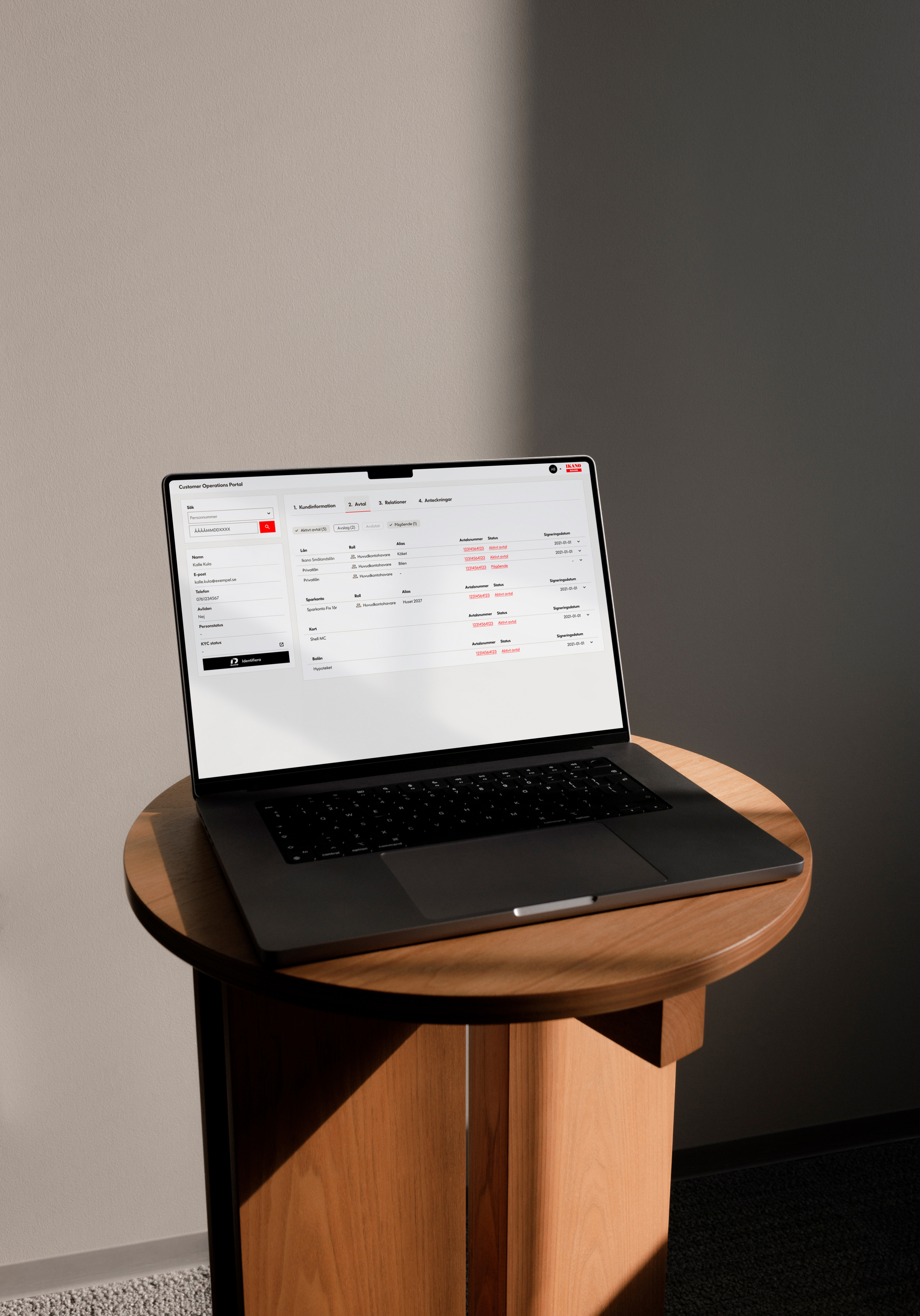
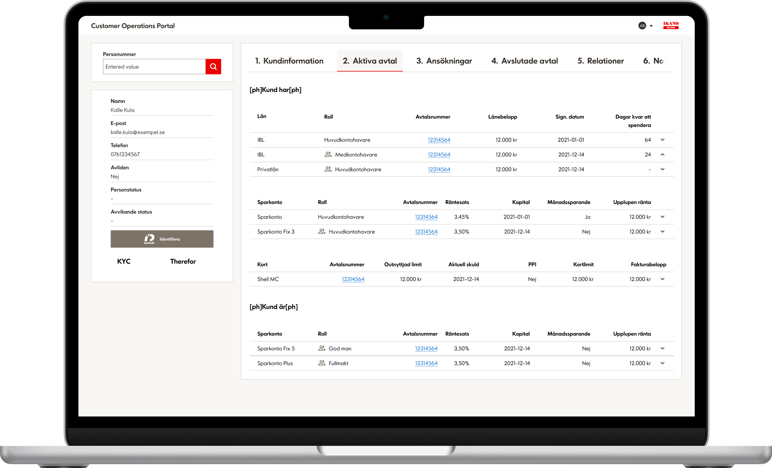
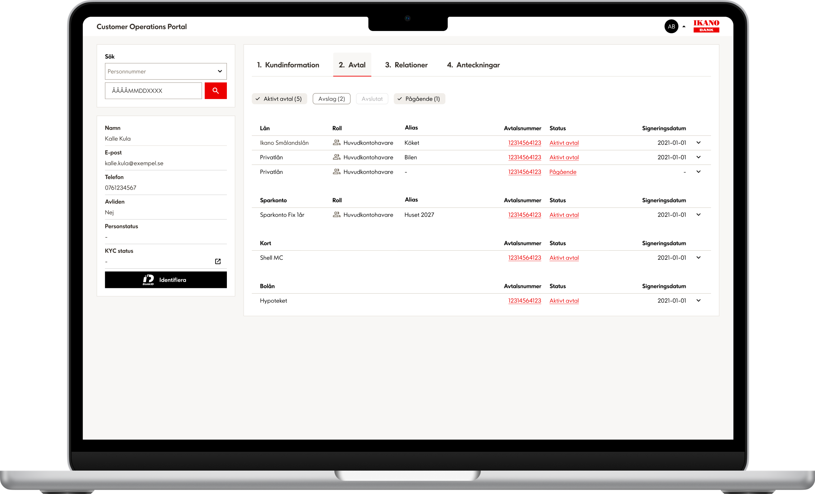
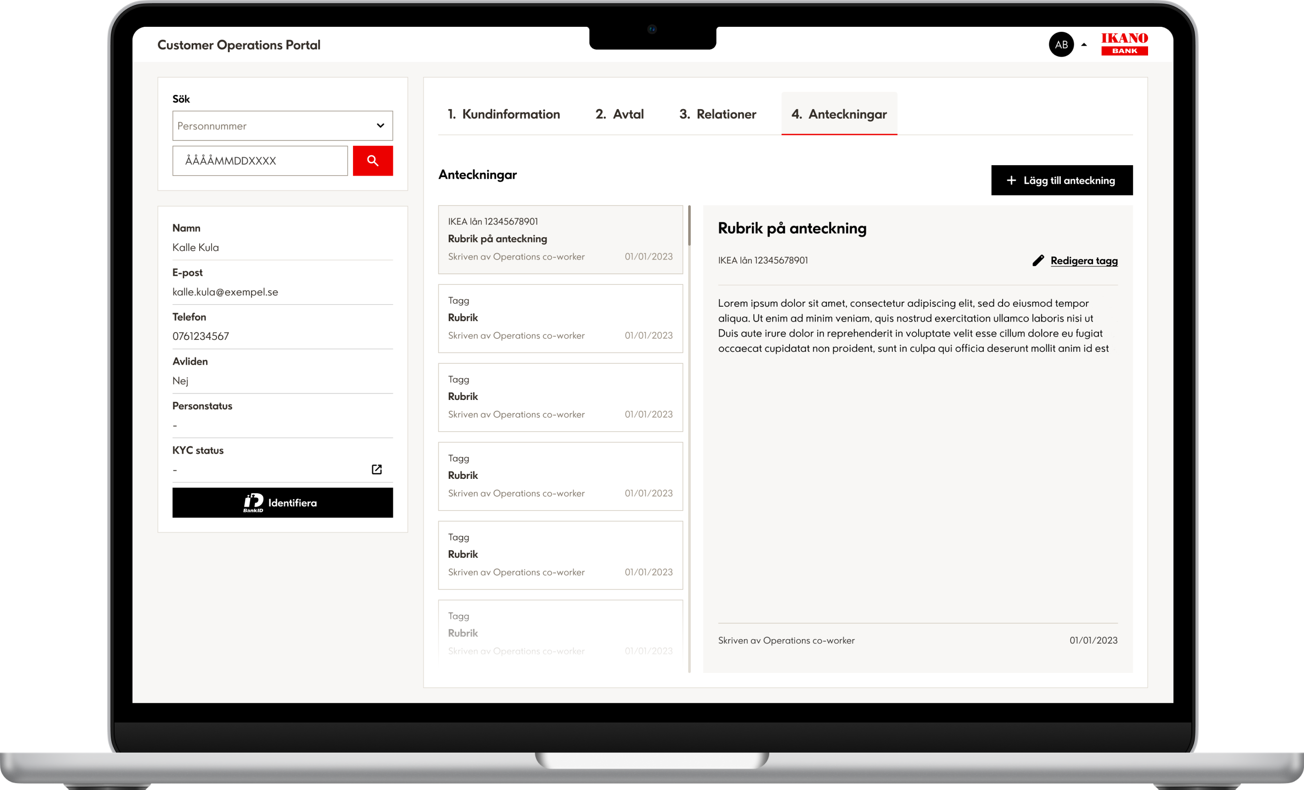
During my internship at Ikano Bank, I joined a cross-functional team working within SAFe to improve an internal system used daily by expert users. While supporting new feature development, I also identified opportunities to enhance clarity, workflow, and increase consistency across the experience. The challenge was to improve usability without disrupting a technical setup and interconnected systems. This required close collaboration, continuous alignment, and an iterative design approach.
Note: The content presented in this case study has been reviewed and approved by the client for public portfolio use. Sensitive or proprietary information has been removed or anonymised.
ROLE
UX Designer (internship)
Team
1 designer (me), 1 Project manager, 1 product specialist, 4 developers and 5 expert users
Timeline
2 monts, March - May, 2025
Before
After
Ikano Bank
Ikano Bank was founded in Sweden in 1995, inspired by the same vision as IKEA: to offer a fair and accessible alternative for everyday financial needs. Today, Ikano Bank operates in eight European markets and is part of the Ingka Group.
RESEARCH
How might we improve clarity, consistency, and daily workflow while respecting existing technical limitations?
To build a foundation I:
This system is made for expert users. I needed some contextual information to really understand the system, so I talked to the team.
Process & Collaboration
To communicate my initial thoughts I began by sketching early ideas, fast low-fidelity explorations that helped me, the team, and most of all users to align on opportunities and limitations before going deeper into Figma.
Throughout the project I collaborated closely with:
Frequent conversations and quick prototype iterations helped maintain alignment and catch issues early. .
Solution
1. UX Refinements
Guided by user input through feedback sessions I improved the system section by section:
These changes reduced cognitive load and made the interface feel more structured and intentional.
2. Updated Design System Components
I replaced outdated UI components with the correct elements from Ikano Bank’s design system, ensuring consistency, better scalability, and clearer developer handover.
3. Data-based Statuses & Tags
To support expert users workflow, I added:
4. New Features
5. Updated User Flow
Updated existing user flow to simplify steps, create clearer decision points, and remove unnecessary friction.
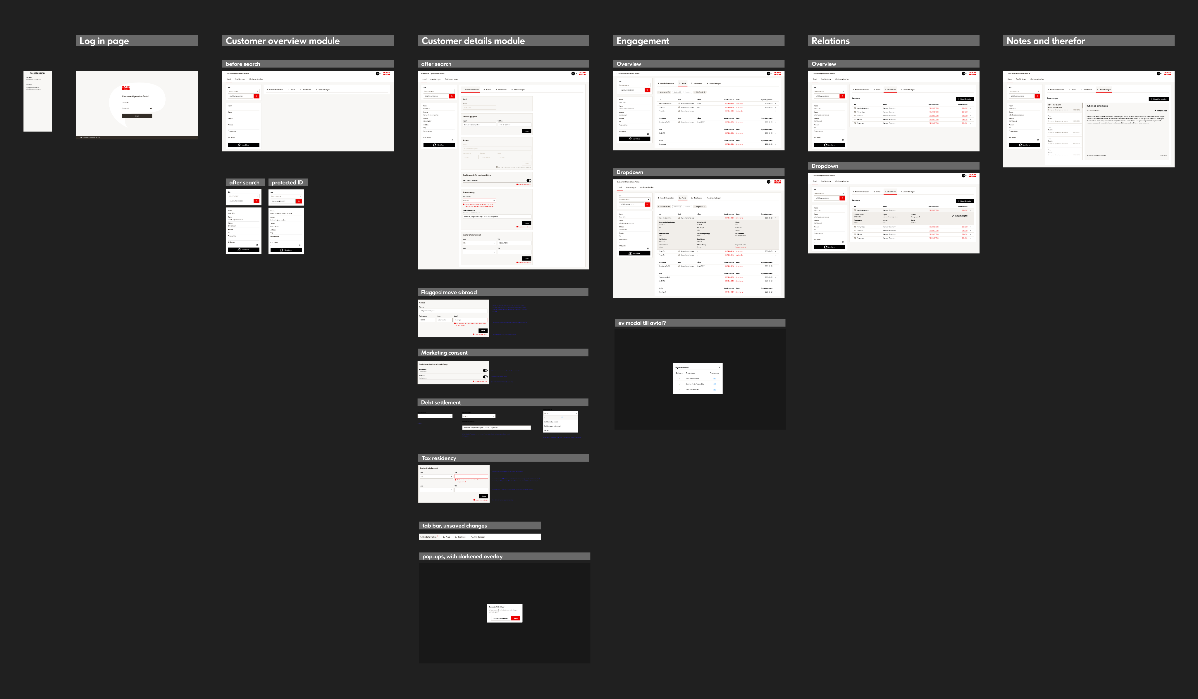
Documentation and flows according to Ikano Bank’s design process.
Outcome
User feedback confirmed that the updated interface felt more intuitive, consistent, and aligned more with their daily workflows.
Handover & alignment
As the work neared development, I led two walkthrough session with the team to review the final designs, align on edge cases, and collect final feedback. I documented patterns, components, and flows to support a smooth handover.
Reflections
This project taught me how critical communication is when balancing usability improvements with technical realities. Rapid sketching and early feedback helped surface constraints early and working with a design system proved essential for creating consistency and reducing cognitive load.
It also showed me how much collaboration benefits from honesty. When I dared to ask the “dumb” questions, it opened the door for others to share their uncertainties too. That transparency created a stronger foundation for teamwork and led to clearer communication and more effective solutions.
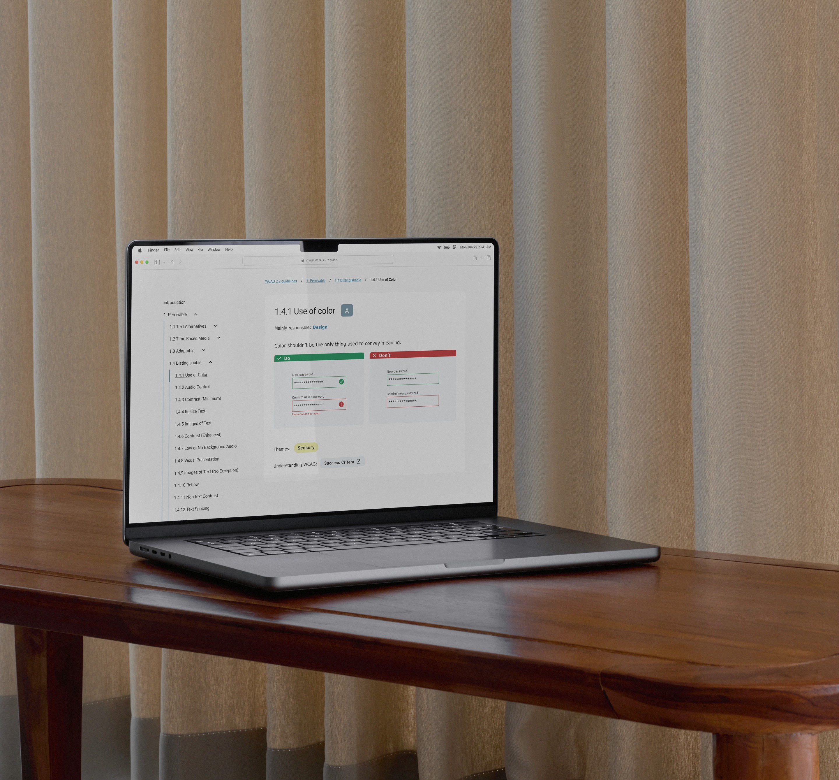
Academic project
Lowering the barrier to accessible design
Identifying why UX designers struggle with WCAG 2.2 and prototyping a visual guide that makes accessibility guidelines easier to understand and apply in design work.
View case study →
Academic project
Finding a niche in the music streaming market
Designing a concept music app focused on electronic music listeners who value genre accuracy, metadata, and curator-driven discovery.
View design overview →
All work →
Ikano Bank
Improving workflow efficiency in a technically constrained banking tool
ROLE
UX Designer (internship)
Team
1 designer (me), 1 Project manager, 1 product specialist, 4 developers and 5 expert users
Timeline
2 monts, March - May, 2025
Overview
During my internship at Ikano Bank, I joined a cross-functional team working within SAFe to improve an internal system used daily by expert users. While supporting new feature development, I also identified opportunities to enhance clarity, workflow, and increase consistency across the experience. The challenge was to improve usability without disrupting a technical setup and interconnected systems. This required close collaboration, continuous alignment, and an iterative design approach.
Note: The content presented in this case study has been reviewed and approved by the client for public portfolio use. Sensitive or proprietary information has been removed or anonymised.
Before
After
Ikano Bank
Ikano Bank was founded in Sweden in 1995, inspired by the same vision as IKEA: to offer a fair and accessible alternative for everyday financial needs. Today, Ikano Bank operates in eight European markets and is part of the Ingka Group.
RESEARCH
How might we improve clarity, consistency, and daily workflow while respecting existing technical limitations?
To build a foundation I:
This system is made for expert users. I needed some contextual information to really understand the system, so I talked to the team.
Process & Collaboration
To communicate my initial thoughts I began by sketching early ideas, fast low-fidelity explorations that helped me, the team, and most of all users to align on opportunities and limitations before going deeper into Figma.
Throughout the project I collaborated closely with:
Frequent conversations and quick prototype iterations helped maintain alignment and catch issues early. .
Solution
1. UX Refinements
Guided by user input through feedback sessions I improved the system section by section:
These changes reduced cognitive load and made the interface feel more structured and intentional.
2. Updated Design System Components
I replaced outdated UI components with the correct elements from Ikano Bank’s design system, ensuring consistency, better scalability, and clearer developer handover.
3. Data-based Statuses & Tags
To support expert users workflow, I added:
4. New Features
5. Updated User Flow
Updated existing user flow to simplify steps, create clearer decision points, and remove unnecessary friction.
Documentation and flows according to Ikano Bank’s design process.
Outcome
User feedback confirmed that the updated interface felt more intuitive, consistent, and aligned more with their daily workflows.
Handover & alignment
As the work neared development, I led two walkthrough session with the team to review the final designs, align on edge cases, and collect final feedback. I documented patterns, components, and flows to support a smooth handover.
Reflections
This project taught me how critical communication is when balancing usability improvements with technical realities. Rapid sketching and early feedback helped surface constraints early and working with a design system proved essential for creating consistency and reducing cognitive load.
It also showed me how much collaboration benefits from honesty. When I dared to ask the “dumb” questions, it opened the door for others to share their uncertainties too. That transparency created a stronger foundation for teamwork and led to clearer communication and more effective solutions.
Academic project
Lowering the barrier to accessible design
Identifying why UX designers struggle with WCAG 2.2 and prototyping a visual guide that makes accessibility guidelines easier to understand and apply in design work.
View case study →
Academic project
Finding a niche in the music streaming market
Designing a concept music app focused on electronic music listeners who value genre accuracy, metadata, and curator-driven discovery.
All work →

Ikano Bank
Improving workflow efficiency in a technically constrained banking tool
ROLE
UX Designer (internship)
Team
1 designer (me), 1 Project manager, 1 product specialist, 4 developers and 5 expert users
Timeline
2 months, March - May, 2025
Overview
During my internship at Ikano Bank, I joined a cross-functional team working within SAFe to improve an internal system used daily by expert users. While supporting new feature development, I also identified opportunities to enhance clarity, workflow, and increase consistency across the experience. The challenge was to improve usability without disrupting a technical setup and interconnected systems. This required close collaboration, continuous alignment, and an iterative design approach.
Note: The content presented in this case study has been reviewed and approved by the client for public portfolio use. Sensitive or proprietary information has been removed or anonymised.
Before
After
Ikano Bank
Ikano Bank was founded in Sweden in 1995, inspired by the same vision as IKEA: to offer a fair and accessible alternative for everyday financial needs. Today, Ikano Bank operates in eight European markets and is part of the Ingka Group.
RESEARCH
How might we improve clarity, consistency, and daily workflow while respecting existing technical limitations?
To build a foundation I:
This system is made for expert users. I needed some contextual information to really understand the system, so I talked to the team.
Process & Collaboration
To communicate my initial thoughts I began by sketching early ideas, fast low-fidelity explorations that helped me, the team, and most of all users to align on opportunities and limitations before going deeper into Figma.
Throughout the project I collaborated closely with:
Frequent conversations and quick prototype iterations helped maintain alignment and catch issues early. .
Solution
1. UX Refinements
Guided by user input through feedback sessions I improved the system section by section:
These changes reduced cognitive load and made the interface feel more structured and intentional.
2. Updated Design System Components
I replaced outdated UI components with the correct elements from Ikano Bank’s design system, ensuring consistency, better scalability, and clearer developer handover.
3. Data-based Statuses & Tags
To support expert users workflow, I added:
4. New Features
5. Updated User Flow
Updated existing user flow to simplify steps, create clearer decision points, and remove unnecessary friction.
Documentation and flows according to Ikano Bank’s design process.
Handover & alignment
As the work neared development, I led two walkthrough session with the team to review the final designs, align on edge cases, and collect final feedback. I documented patterns, components, and flows to support a smooth handover.
Outcome
User feedback confirmed that the updated interface felt more intuitive, consistent, and aligned more with their daily workflows.
Reflections
This project taught me how critical communication is when balancing usability improvements with technical realities. Rapid sketching and early feedback helped surface constraints early and working with a design system proved essential for creating consistency and reducing cognitive load.
It also showed me how much collaboration benefits from honesty. When I dared to ask the “dumb” questions, it opened the door for others to share their uncertainties too. That transparency created a stronger foundation for teamwork and led to clearer communication and more effective solutions.
Academic project
Lowering the barrier to accessible design
Identifying why UX designers struggle with WCAG 2.2 and prototyping a visual guide that makes accessibility guidelines easier to understand and apply in design work.
View case study →
Academic project
Finding a niche in the music streaming market
Designing a concept music app focused on electronic music listeners who value genre accuracy, metadata, and curator-driven discovery.
All work →