Academic project
Finding a niche in the music streaming market
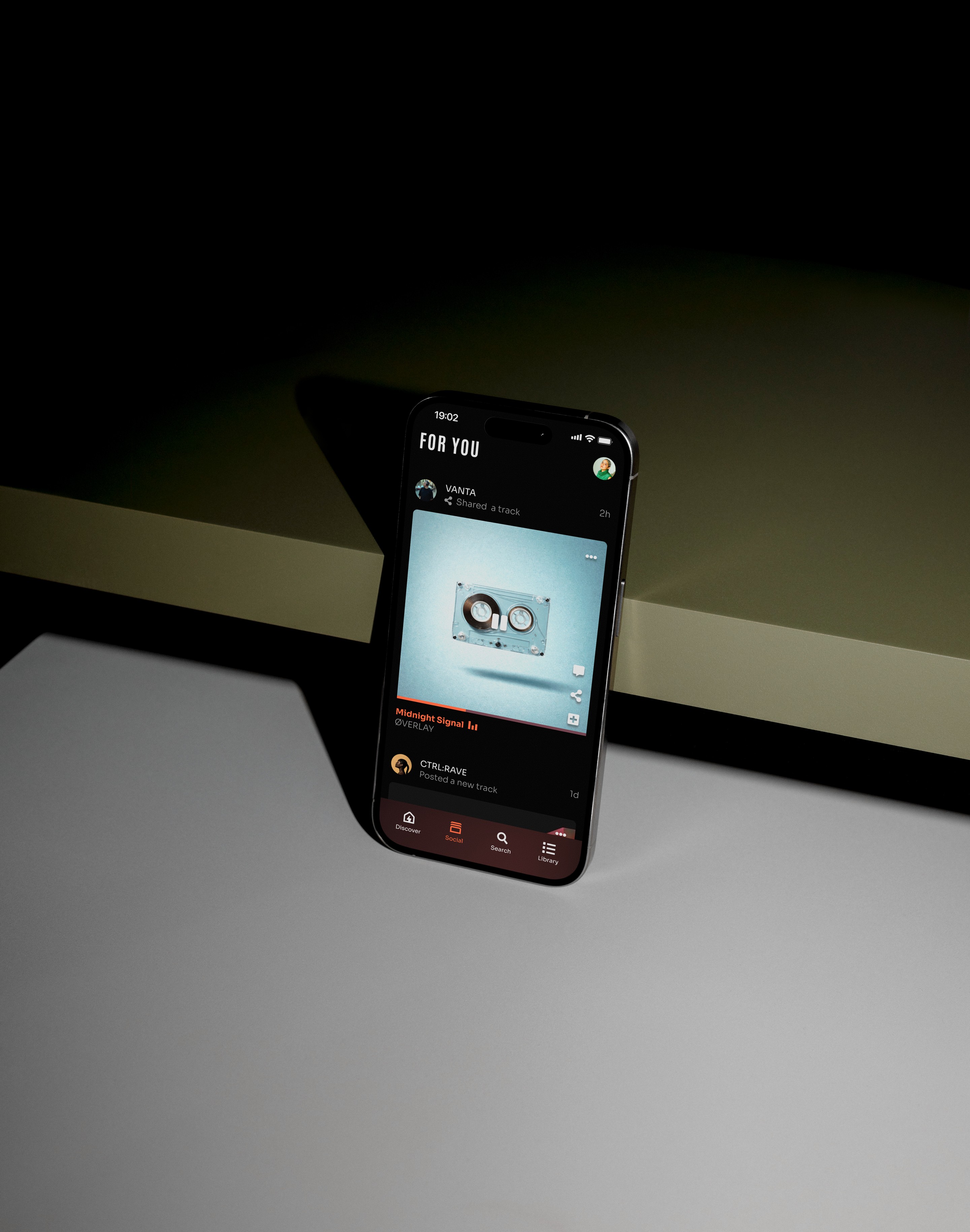
Designing a concept music app focused on electronic music listeners who value genre accuracy, metadata, and curator-driven discovery.
View design overview →


Academic project
Lowering the barrier to accessible design
Problem
How might we lower the barrier for UX designers to start practicing accessibility in their everyday work?
Accessibility guidelines such as WCAG 2.2 are essential for creating inclusive digital products, yet many UX designers struggle to translate them into practical design decisions.
The documentation is comprehensive but highly technical, making it difficult to navigate during everyday design work.
ROLE
UX designer (thesis)
Team
Independent project with feedback from UX peers, and supervisor (Hans-Christian Stoltz).
Timeline
3 weeks, February, 2025
scope
User research, insight synthesis, concept development, information architecture, and mid-fidelity prototyping of a visual accessibility guide.
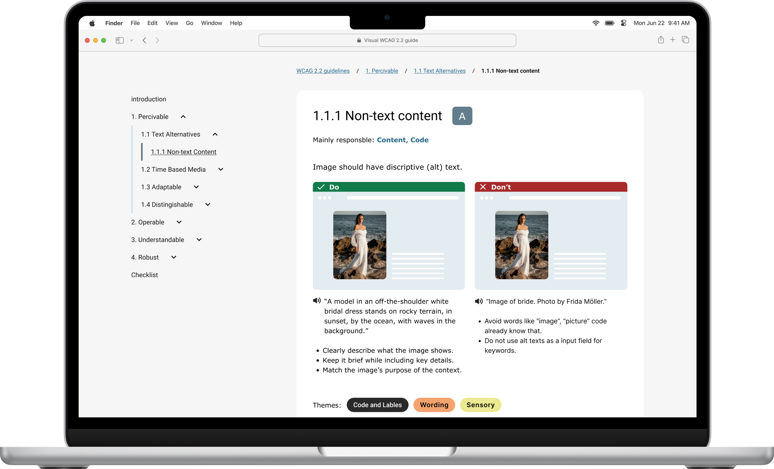
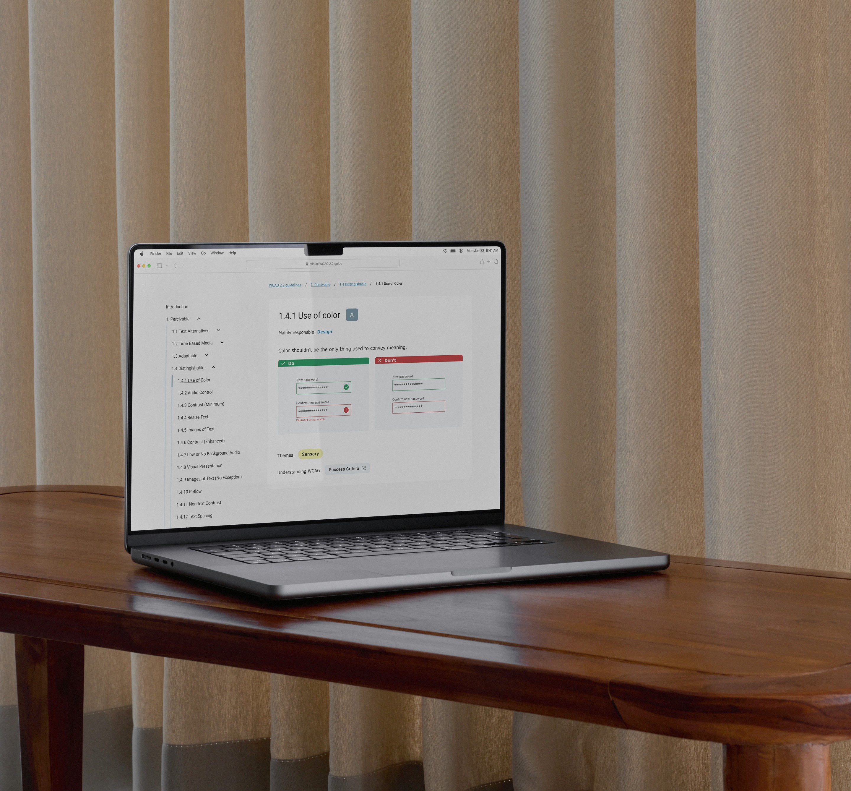
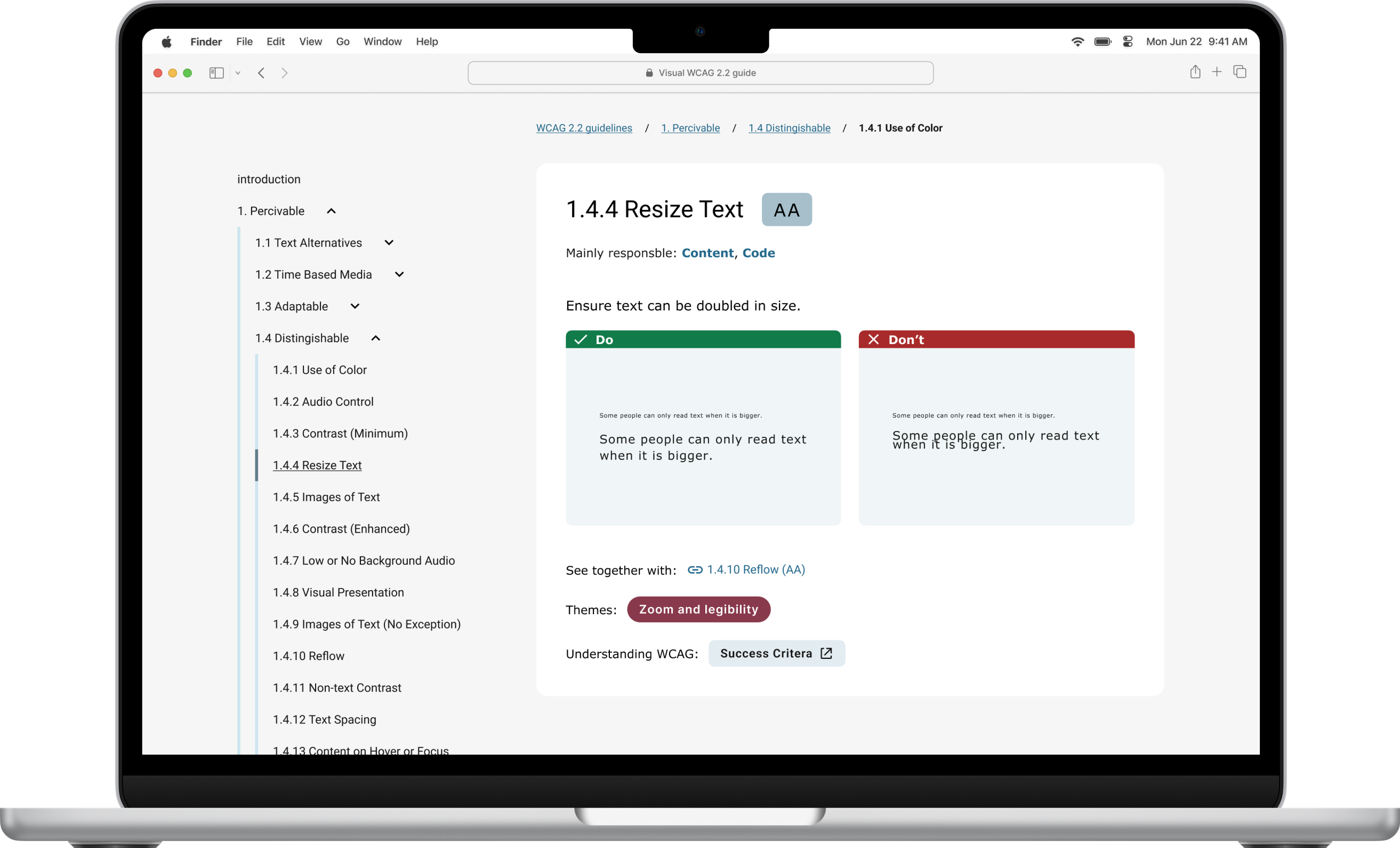
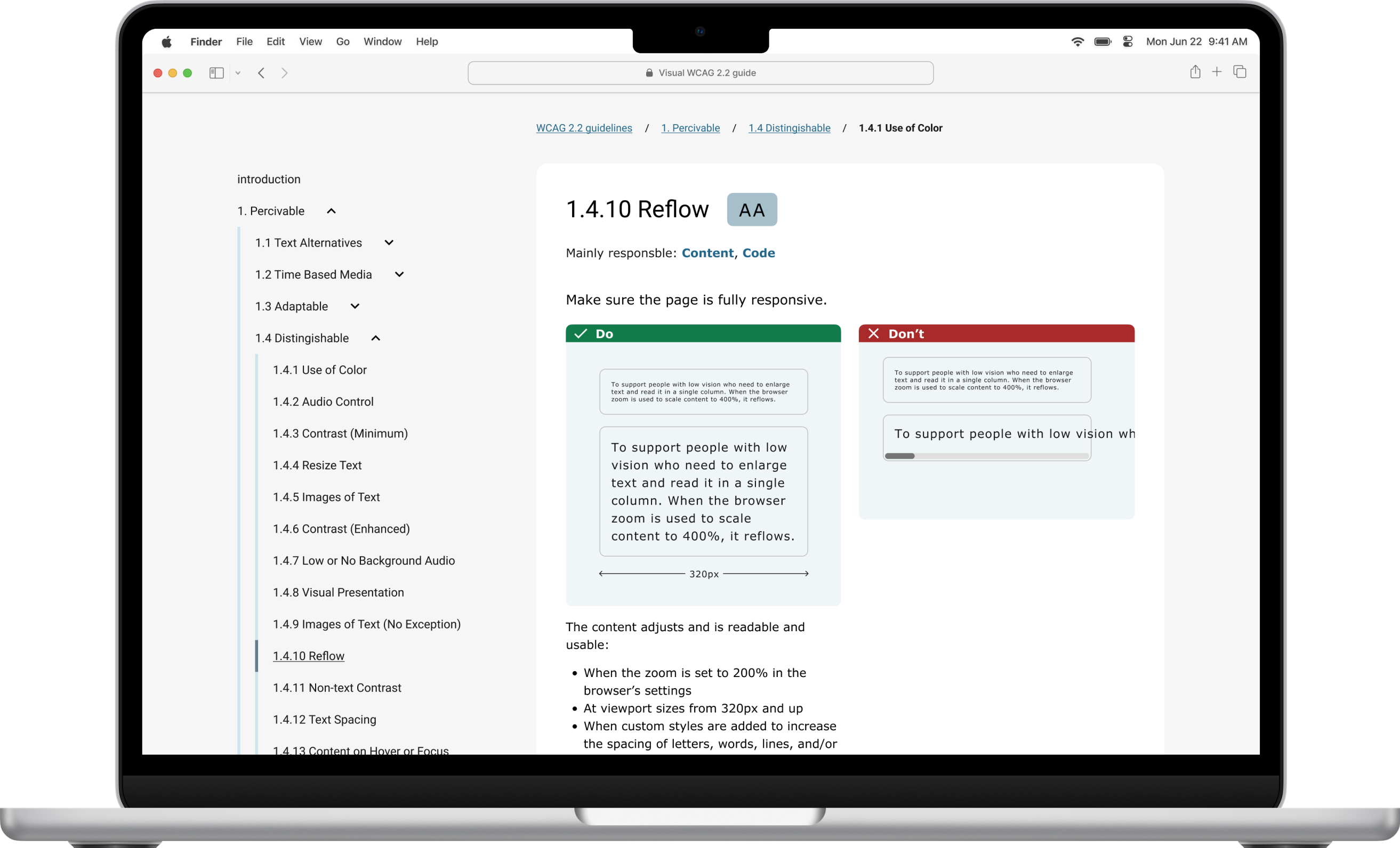
I researched how designers currently understand and use accessibility guidelines, then prototyped a visual accessibility guide designed to make WCAG easier to navigate and apply.
The concept introduces:
Based on research from Melbourne university and Johannes Lehners WCAG 2.2 Card deck
Created by Andrew Hick, accessibility specialist at UK goverment.
The guide keeps the familiar POUR structure while presenting information in a more visual, scannable format.
Outcome
Research showed that many designers are aware of accessibility standards but struggle to implement them in practice.
The prototype demonstrates how visual structure, hierarchy, and design principles can make accessibility guidelines easier to understand and integrate into everyday design workflows.
Process
Survey with 21 UX designers across different experience levels with open-ended questionnaire and led a qualitative interview with a senior designer.

52%
52% find it difficult to implement accessibility requirements in their design work.
15%
15% (including senior designers) were unsure when WCAG 2.2 becomes mandatory in Sweden.
57%
Only 57% feel they have a good understanding of WCAG 2.2.
Common barriers included
Ideation & Prototyping
I benchmarked existing accessibility resources and identified that most documentation is text-heavy and difficult to scan.
I then explored visual concepts through low- and mid-fidelity prototypes focused on:
The concept was iterated through feedback sessions with UX peers and my supervisor.
Reflection
This project reinforced how difficult it can be to translate standards into practical design decisions.
If I were to develop the concept further, I would involve accessibility specialists and designers with different experience levels earlier in the process and run structured usability testing to validate the guide. I would also continue working och the UI, making it more visually appealing.
Inclusive design is not just about following guidelines and ticking boxes, you always need to test it with real users.
Academic project
Finding a niche in the music streaming market
Designing a concept music app focused on electronic music listeners who value genre accuracy, metadata, and curator-driven discovery.
View design overview →
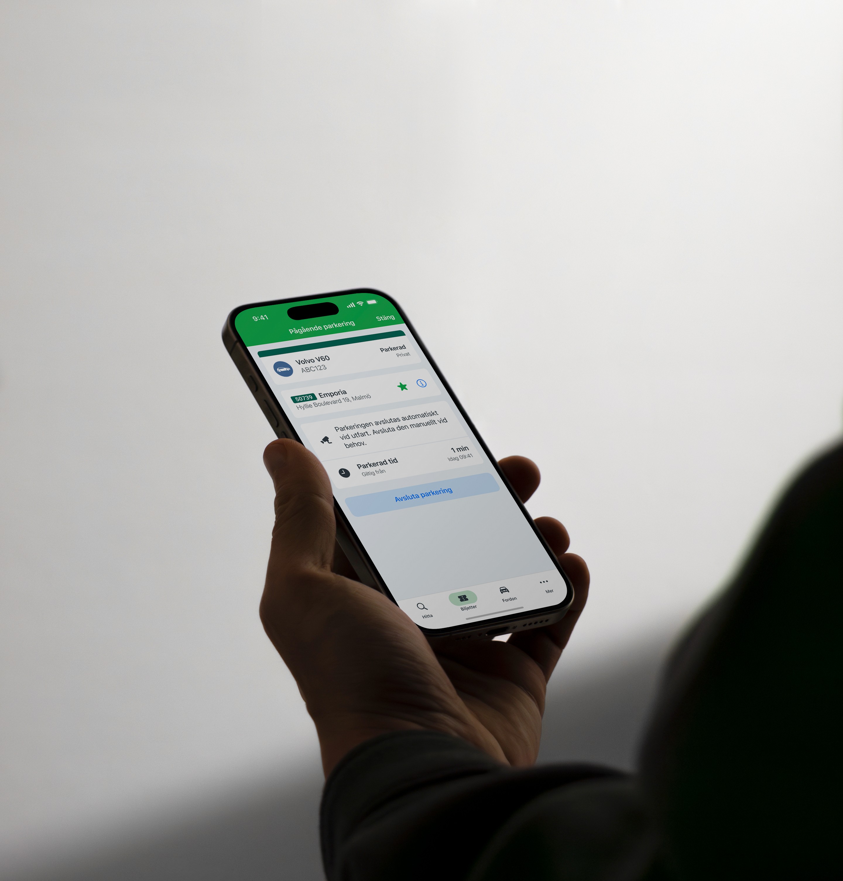
Parkster
Reducing uncertainty in automatic parking
Aligning user mental models with system behaviour to build trust and prevent costly misunderstandings.
View case study →
All work →
Academic project
Lowering the barrier to accessible design
ROLE
UX designer (thesis)
Team
Independent project with feedback from UX peers, and supervisor (Hans-Christian Stoltz).
Timeline
3 weeks, February, 2025
scope
User research, insight synthesis, concept development, information architecture, and mid-fidelity prototyping of a visual accessibility guide.
Problem
How might we lower the barrier for UX designers to start practicing accessibility in their everyday work?
Accessibility guidelines such as WCAG 2.2 are essential for creating inclusive digital products, yet many UX designers struggle to translate them into practical design decisions.
The documentation is comprehensive but highly technical, making it difficult to navigate during everyday design work.
I researched how designers currently understand and use accessibility guidelines, then prototyped a visual accessibility guide designed to make WCAG easier to navigate and apply.
The concept introduces:
Based on research from Melbourne university and Johannes Lehners WCAG 2.2 Card deck
Created by Andrew Hick, accessibility specialist at UK goverment.
The guide keeps the familiar POUR structure while presenting information in a more visual, scannable format.
Outcome
Research showed that many designers are aware of accessibility standards but struggle to implement them in practice.
The prototype demonstrates how visual structure, hierarchy, and design principles can make accessibility guidelines easier to understand and integrate into everyday design workflows.
Process
Survey with 21 UX designers across different experience levels with open-ended questionnaire and led a qualitative interview with a senior designer.

57%
Only 57% feel they have a good understanding of WCAG 2.2.

52%
52% find it difficult to implement accessibility requirements in their design work.
15%
15% (including senior designers) were unsure when WCAG 2.2 becomes mandatory in Sweden.
Common barriers included
Ideation & Prototyping
I benchmarked existing accessibility resources and identified that most documentation is text-heavy and difficult to scan.
I then explored visual concepts through low- and mid-fidelity prototypes focused on:
The concept was iterated through feedback sessions with UX peers and my supervisor.
Reflection
This project reinforced how difficult it can be to translate standards into practical design decisions.
If I were to develop the concept further, I would involve accessibility specialists and designers with different experience levels earlier in the process and run structured usability testing to validate the guide. I would also continue working och the UI, making it more visually appealing.
Inclusive design is not just about following guidelines and ticking boxes, you always need to test it with real users.
Academic project
Finding a niche in the music streaming market
Designing a concept music app focused on electronic music listeners who value genre accuracy, metadata, and curator-driven discovery.
Parkster
Reducing uncertainty in automatic parking
Aligning user mental models with system behaviour to build trust and prevent costly misunderstandings.
View case study →
All work →

Academic project
Lowering the barrier to accessible design
ROLE
UX designer (thesis)
Team
Independent project with feedback from UX peers, and supervisor (Hans-Christian Stoltz).
Timeline
3 weeks, February, 2025
scope
User research, insight synthesis, concept development, information architecture, and mid-fidelity prototyping of a visual accessibility guide.
Problem
How might we lower the barrier for UX designers to start practicing accessibility in their everyday work?
Accessibility guidelines such as WCAG 2.2 are essential for creating inclusive digital products, yet many UX designers struggle to translate them into practical design decisions.
The documentation is comprehensive but highly technical, making it difficult to navigate during everyday design work.
I researched how designers currently understand and use accessibility guidelines, then prototyped a visual accessibility guide designed to make WCAG easier to navigate and apply.
The concept introduces:
Based on research from Melbourne university and Johannes Lehners WCAG 2.2 Card deck
Created by Andrew Hick, accessibility specialist at UK goverment.
The guide keeps the familiar POUR structure while presenting information in a more visual, scannable format.
Outcome
Research showed that many designers are aware of accessibility standards but struggle to implement them in practice.
The prototype demonstrates how visual structure, hierarchy, and design principles can make accessibility guidelines easier to understand and integrate into everyday design workflows.
Process
Survey with 21 UX designers across different experience levels with open-ended questionnaire and led a qualitative interview with a senior designer.

57%
Only 57% feel they have a good understanding of WCAG 2.2.
52%
52% find it difficult to implement accessibility requirements in their design work.
15%
15% (including senior designers) were unsure when WCAG 2.2 becomes mandatory in Sweden.
Common barriers included
Ideation & Prototyping
I benchmarked existing accessibility resources and identified that most documentation is text-heavy and difficult to scan.
I then explored visual concepts through low- and mid-fidelity prototypes focused on:
The concept was iterated through feedback sessions with UX peers and my supervisor.
Reflection
This project reinforced how difficult it can be to translate standards into practical design decisions.
If I were to develop the concept further, I would involve accessibility specialists and designers with different experience levels earlier in the process and run structured usability testing to validate the guide. I would also continue working och the UI, making it more visually appealing.
Inclusive design is not just about following guidelines and ticking boxes, you always need to test it with real users.
Academic project
Finding a niche in the music streaming market
Designing a concept music app focused on electronic music listeners who value genre accuracy, metadata, and curator-driven discovery.
Parkster
Reducing uncertainty in automatic parking
Aligning user mental models with system behaviour to build trust and prevent costly misunderstandings.
View case study →
All work →